Multi-select Fields in Salesforce vs. Siebel MVF
Multiple-value fields, or multi-select fields are typical in any CRM system. For e.g. an account has multiple addresses, or, a contact can have multiple telephone numbers.
But, so far CRM systems except Siebel have been laggards in implementing such a function. The typical use case for such field is shot down with two arguments-
- You can associate multiple values by creating a child entity under the parent
- You can use the same field to capture multiple values (just use a delimiter)
These are work-around solutions, and do not solve the problem effectively.
Multi-select is the term applicable for this kind of “multiple-value” fields in Salesforce. This is how they look..
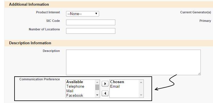
If you remember the old “associate applet against MVG in Siebel” by looking at this, I cannot blame you. The multi-select fields are akin to multi-value fields (on LOV entity) in Siebel. Siebel does not have any straight-forward configuration for 1:M or M:M relationship with the “List of Values” entity (there may be exceptions). But a few additional configuration steps are going to take care of the problem, but not so the way users work with the fields.
In Siebel 7:
- User has to click on a popup icon in the field, a multi-value group (“MVG”) applet opens up with available values
- User will then click on a button to open up another popup (the “associate” applet)
- User selects one or more values, and hit “OK” to add all of them
- Close MVG applet
If you don’t see anything wrong with this - congrats, you have been in Siebel too long. The above process requires one too many clicks, and users seldom want to loose sight of data with multiple popups.
Siebel improved this experience in later versions by introducing the “associate” applet side by side with the main MVG applet. Users could then see the list of values available for selection, and choose one or more of them. It is another matter that Siebel has gone back to its older way of thinking with Open UI.
The main problem, as I see it, is number of clicks it takes to populate multi-value fields.
As you see from the above picture, Salesforce works around the problem by enabling the multiple-selection from the main screen itself. This saves two clicks for every multi-select field. The experience is similar to many of the web forms, and the old Windows forms, and users can immediately identify what they are expected to do.
The limitation of such a UI decision - you cannot have too many values in “Available” part of the multi-select field. There is no way to sort/query on the available values, nor is there straight-forward way to choose any related entity (for e.g. selecting Contacts for the Account). You would still rely on associating/creating those records through the related lists in Salesforce.