Make Siebel Usable
Usability requirements will be one in top 5 considerations for any new application deployment. However, they are seldom given the due respect in Siebel projects. IT functional and technical analysts assume that what Siebel provides out of the box (OOB) is holy and often push back on things that are not good from an application perspective (we don’t get into the merits of that argument here). This, according to me, is a completely wrong approach to address the problem. Wrong usability decisions introduce negatively impact business-user productivity. And, regardless of whether IT likes it or not - everything in the organization is centered around the core business. So, the mantra is simple “make Siebel usable!”.
Traditional Siebel applications do not get high marks for a beautiful and working user interface (“UI”). But there are ways to work within this framework to offer a more usable application. Note that when I say traditional it applies to Siebel High Interactivity and Standard Interactivity applications, though it focuses more on the former. OpenUI is a different game with different set of rules.
The following sections are practical tips on how to get about the usability factor.
When to focus on usability? #
In three words - “all the time”.
Usability focus should start from the requirements gathering phase (or as part of user stories). If the users have no clue on defining it, well - that’s what the IT team gets paid for. Help the users get the usability requirements up there - from the user’s perspective. Though generalizing the requirement helps, user requirements specific to a particular scenario/capability will help more. For e.g.,
In addition to saying
System response time for any transaction shall not exceed 10 seconds
it will be helpful to draw out specifics where applicable
System shall display the acknowledgement of the modification to the order within 5 seconds. System shall provide to the modification confirmation within 30 seconds of providing the acknowledgement message.
While writing the system functional specifications, the technical team will get its opportunity to think through how a particular user requirement can be addressed within the product framework. The actions are captured in the technical design for processing further on.
What to Focus On? #
Usability has everything to do with how users see or perceive the system, it can be broadly classified under:
- UI Layout and Navigation: What information does the user see on the page, how does she navigate to the next action
- User Feedback: How does the system keep the user informed at all times?
- Performance: How quickly does the system perform the action initiated by user?
- Visual Cues and Productivity Enhancers
Each of the three heads defined above are addressed to some or most extent in all Siebel implementations, the only thing missing is the rigor. Let’s look at how we can address usability requirements in a Siebel application.
UI Layout and Navigation #
Regardless of what Siebel used to preach about grouping information in screens and views, it has been long clear that:
- Users do not really love the fact that screen has an over-dose of information
- Users hate to navigate to perform actions
Siebel developers are accustomed to seeing screens and views grouping information around objects. For example, contact screen has the main contact views (that enforce visibility) and contact detail views that show associated entities grouped nearly in different views. This makes the application grouped well, but does not help the task at hand. Siebel developers also like to cram information in available screens so as to minimize number of screens required to show different information for different groups of users. These practices have changed considerably, but need to change more:
- Show only relevant information to the user. If this means having different applets/views for different set of users, so be it.
- Identify groups of users performing a task or set of tasks, identify relevant information for those tasks, optimize all information and display personalized information. This can be as simple as creating two separate applets for four sets of users wanting different information, and showing/hiding applets using personalization
- See whether a 2 column information display makes sense if there is lesser information, rather than the standard 4 column one
- As a rule of thumb, always prefer to have the entire view visible to users without the need to scroll up and down
- Use the fourth level navigation effectively. This is considered much better to switch rather than drilling down on fields
- Keep things consistent and organized
- If date fields need to show date controls, all date fields should show date controls. Same goes for other fields as well
- Group related information on the form applets in a frame. For e.g. all address fields in a address frame
- Tab layout should be consistent across the application
- Keep navigation to a minimum
- DO NOT follow Siebel OOB navigation blindly
- Data entry should NEVER be split across screens. For e.g. if you have a group of users who will search/create contacts, and take orders, all the transactions should be enabled in a single screen
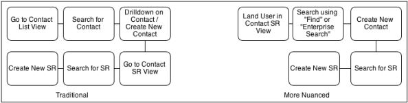
- For frequently used tasks, make all information available to perform the task. For e.g. consider the following scenario

The diagram below illustrates the traditional way vs. a possible improved way of enabling the above flow.
- Evaluate popping up details on specific fields, rather than requiring the user to navigate by drilling down on fields
- When you have to get the user to navigate across screens, ensure that enough cues are provided on how to get back to where the task started. For example in the above scenario, thread bars, training about using back button, or even a automated/assisted navigation back to the starting screen will help
- Use Task Based UI to align screens and navigation around a task for less frequently used tasks
- Enable keyboard and mouse actions. Shortcut keys for all buttons, menu options will help. References to shortcut keys in user manuals, cheat sheets and the contextual help will periodically refresh the knowledge
- Use iHelp to provide contextual help and navigation aids
User Feedback #
Provide constant feedback to the user in all transactions. A non-responsive system is a system that will kill itself.
- Any long running transaction has to be carefully evaluated. If you have an interface that is expected to run for more than 5-10 seconds, make it asynchronous
- Provide the option to cancel long running queries
- When you have transactions that are long running and need to be synchronous, provide a helpful message upfront
- Get the functional team to rewrite all errors with no technical jargon. Any errors should be having the error description, and what to do to make the error go away. Error codes (other than those you don’t control) in the messages are a big NO
- Log any errors (a must for interface errors), and provide the user with an ability to view and possibly take action on errors
Performance #
Establish performance criteria upfront and work towards achieving it in all transactions. The general tendency to “implement functionality first, take care of performance later” should be avoided.
- Perceived response times are important for the user. Even if the entire transaction takes 30 seconds, what gets considered is the immediate response (possibly an acknowledgement)
- Even critical tasks deemed to be synchronous till actual completion can be evaluated to check the nature of errors during the transaction and the transactions can be split to achieve better performance
- Keep an eye open on logs during the development/system test. If you have a monitoring tool or an aggregator that can show the performance of various transactions, all the better
Visual Cues and Productivity Enhancers #
This is a catch-all header for rest of the usability promoters.
- Visual cues often do what simple text cannot. Examples are:
- A “star” at the top of the application when viewing an important customer
- Mark the records that have exceeded SLAs in RED colour
- Use icons / bitmaps to convey information
- Explore ways of providing easier access to perform actions. It is equally important to publish this from time to time and include these in user training materials and courses
- Attachments can be dragged and dropped on the relevant applets
- Bookmarks can be created and shared with others
- An email can be sent within the application in the context of the current record by automatically pulling in relevant information
Final Words #
Siebel high interactivity application are dying, but will take some time to fade away. A strong focus on usability will meanwhile help business to go about their day-to-day tasks more effectively while IT worries about how to get the next-gen OpenUI or next-gen CRM application.